What to Wear for a Photoshoot, Clothing, Makeup and Preparation Guide
What you wear sets the tone. This straight-talking guide covers outfits, colour palettes, patterns,...
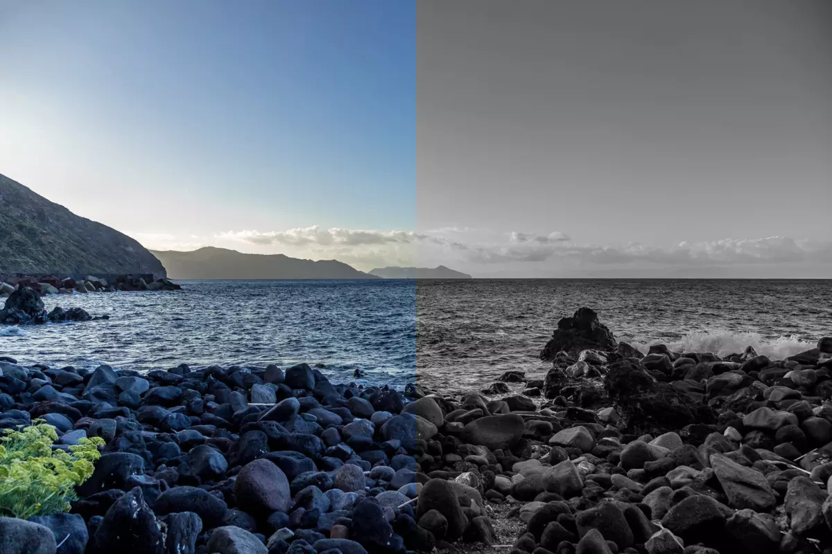
Great images begin with intent. Strip away colour and you reveal form, light, and emotion. Keep the colour, and you gain mood, realism, and atmosphere. The right choice depends on what you want the image to say.

Great images begin with intent.
Strip away colour and you reveal form, light, and emotion. Keep the colour, and you gain mood, realism, and atmosphere. The right choice depends on what you want the image to say.
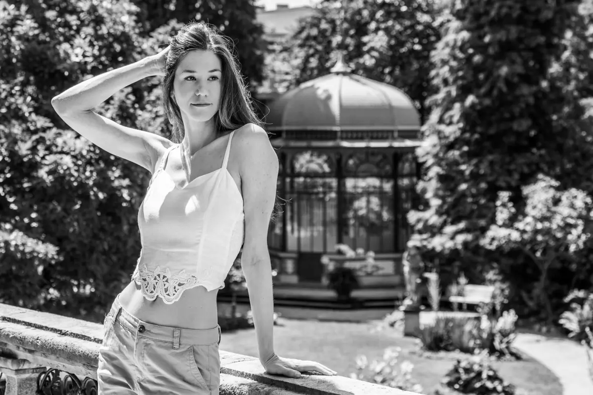
Timeless feel: Monochrome cuts through trends and keeps attention on expression, texture and shape.
Contrast and tone: With light and shadow as your tools, depth and drama emerge.
Simplifies busy scenes: Removing colour declutters scenes so patterns and gestures stand out.
Emotional focus: Without colour cues, the viewer reads faces, posture and feelings.
Best for portraits with strong expression, architectural lines, gritty streets, dramatic light, fog, rain, hard sunlight, and high-ISO scenes where grain looks good.
Realism and context: Colour anchors the image in time and place: skin tones, brand colours, seasons.
Visual impact: Palettes set the emotional temperature. Warm vs cool, bold vs subtle.
Creative control: You can guide the eye with deliberate contrast and repetition.
Versatility: From lifestyle to product to landscape, colour carries story and texture.
Best for: Branding, travel, food, fashion, anywhere palette and environment shape the story.
Purpose: Legacy portraits often lean toward black & white. Marketing campaigns usually need colour.
Light: Strong direction suits black & white; flat light benefits from colour.
Background: Busy scenes simplify better in monochrome.
Wardrobe and palette: If colour styling is part of the concept, keep it.
Mood: Black & white flatters skin tones and feels introspective. Colour feels immediate and relatable.
See in tones: Look for shape, shadow and clean composition. If the colour is the only interest, it will not translate into a good photograph.
Light with intent: Side or backlight defines form. Avoid flat midtone mush.
Mind the mix: Red and green may look distinct in colour, but merge into similar greys. Check your monochrome preview on the camera.
Edit for depth: Separate tones, add gentle contrast, and preserve highlights. A little grain can add character.
Pick a palette: Limit to two or three key colours. Use neutrals elsewhere.
Control white balance: Keep skin natural and mood consistent.
Guide attention: Use warm vs cool contrast to lead the eye.
Tame distractions: Desaturate tiny hot spots and calm aggressive reds; they shout louder than one expects.
Using black & white as a fix: Monochrome doesn't rescue bad composition, it amplifies and exposes it.
Crushing contrast: Overediting kills nuance. Keep air in the highlights and depth in the shadows.
Neglecting skin tones: Manage saturation in colour; balance reds and yellows in monochrome.
Defaulting to one look: Choose based on the story, not the habit or a current trend.
If colour adds meaning, keep it.
If colour adds noise, lose it.
Shoot with the final use in mind, and you will make the right call more often than not.
Both approaches are powerful. Black & white leans timeless and emotive; colour feels vivid and immediate. Pick the one that serves the story—then commit and craft it well.
Personally, I shoot mostly in black and white (because I’m largely colourblind), converting to colour in post-production. White, grey, and pink merge together; so do black, dark blues, and purples. Maybe that’s why monochrome feels honest to me. It strips away what I can’t see and leaves what matters: light, form, and emotion.
Contattateci per discutere delle vostre esigenze fotografiche.

What you wear sets the tone. This straight-talking guide covers outfits, colour palettes, patterns,...

In today’s competitive business world, standing out from the crowd is essential, and one way to do t...

Al giorno d'oggi tutti sono fotografi. Smartphone ovunque, social media costantemente affamati di co...